kitchen + Dining
“It’s important how we feel in our homes, because feeling good makes us more gracious. And that makes it easier to welcome others not only into our homes but into our lives.” Nate Berkus
Grandville #1: kitchen
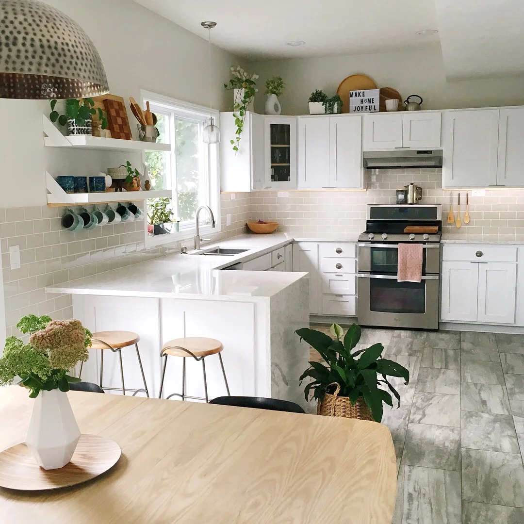
This Grandville kitchen started out the same way most kitchens do in houses built late in the last millennia: golden oak. Functionally, the kitchen was fantastic. There were no complaints about the work triangle or storage, but the laminate counters had chipped, the glossy faux marble floor just wasn’t working, and the oak was feeling tired and orangy.
An incredible floor tile was the jumping off point for the entire update. The tile would be the star of the show, and everything else would need to support that decision. Quartz was chosen for the counter because of it’s ability to mimic marble, with less maintenance and more durability, ideal for a family with young kids, prone to spills. Rather than gutting the kitchen, the cabinet boxes, which were in great shape, were filled, primed and painted, and replacement doors were ordered and painted offsite for a professional grade, hard-wearing finish. Pale gray subway tile completed the foundation for this timeless look.
Details are the jewelry of the kitchen, some understated, some functional, and some like an amazing statement necklace. Tab pulls were selected for their minimal appearance, with round pulls selected for the drawers for added interest. A slim birch rail hugs the underside of the cabinets and adds functionality with small hooks for mugs and utensils. Taking time to select items that are both useful and beautiful allows you to store those items right out in the open, making them easily accessible for everyday use and pulling double duty to contribute to the overall design and decor of the space.
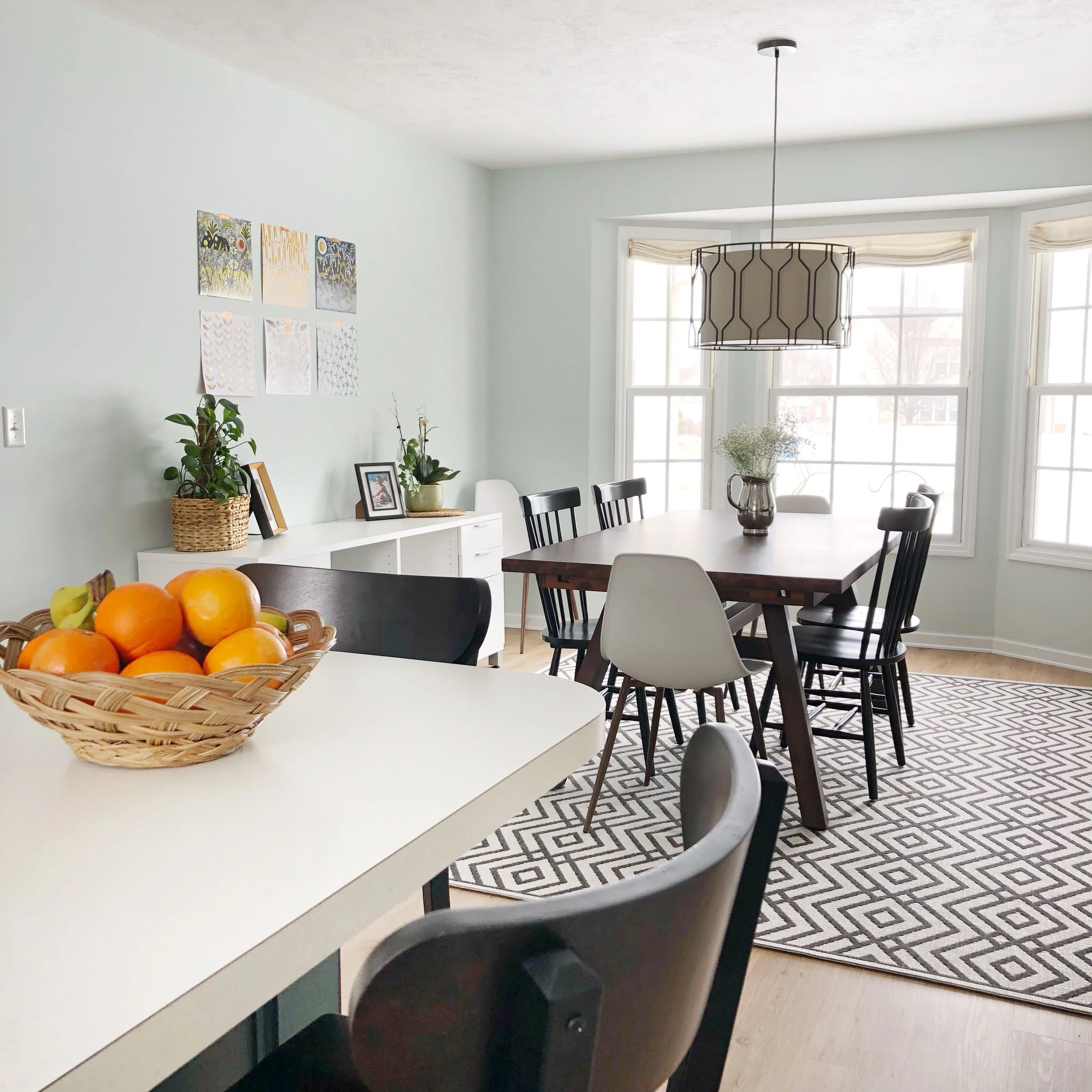
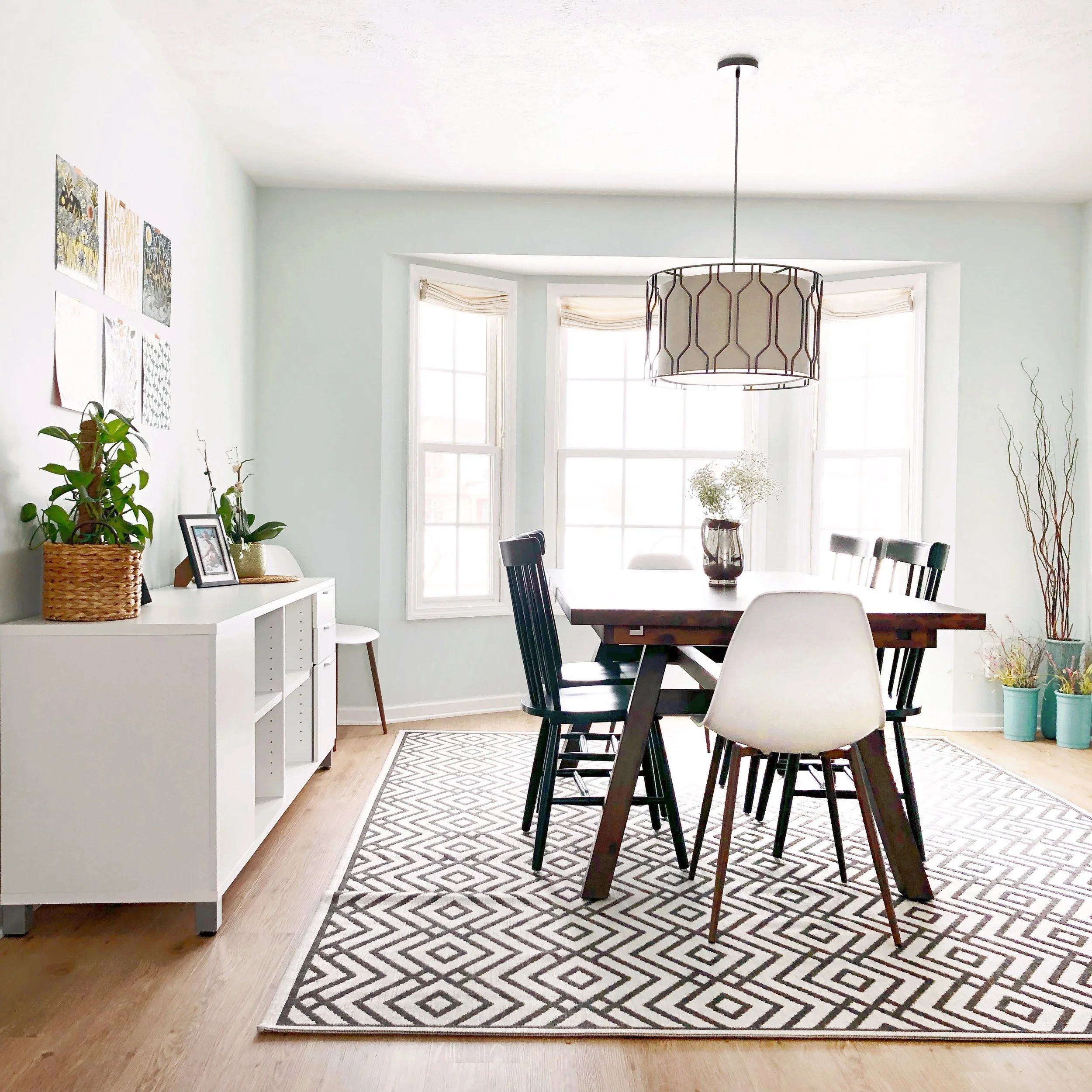
hudsonville #1: kitchen + Dining
While the golden oak cabinets of the 90s are heading towards extinction, many of the layouts are standing the test of time with functional work areas, sufficient storage and plenty of counter space. This provides the opportunity to make big-impact updates with less investment than a fully gutted and rebuilt kitchen renovation.
Slightly rustic transitional with a touch of mid-century was the overall design direction for this kitchen and dining refresh. Taking into account the fun personalities and great sense of humor of these clients and their little boy, a dash of whimsy would need to find its way into the space as well.
Something I love about consultative design is that I was able to create a road map with this client, who was then able to chip away at projects at their own pace; saving money by doing a few things themselves, and hiring out other tasks to contractors they had worked with before.
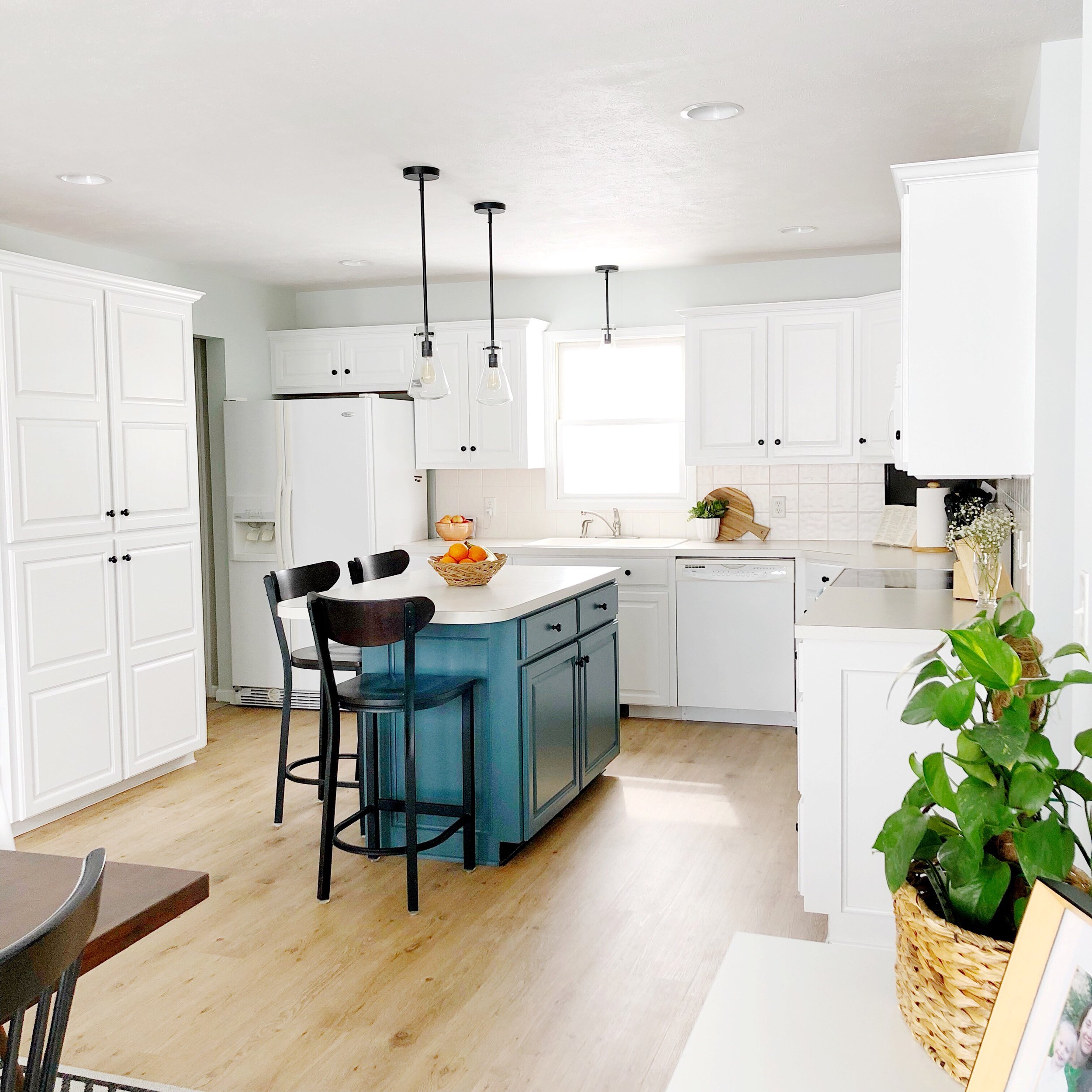
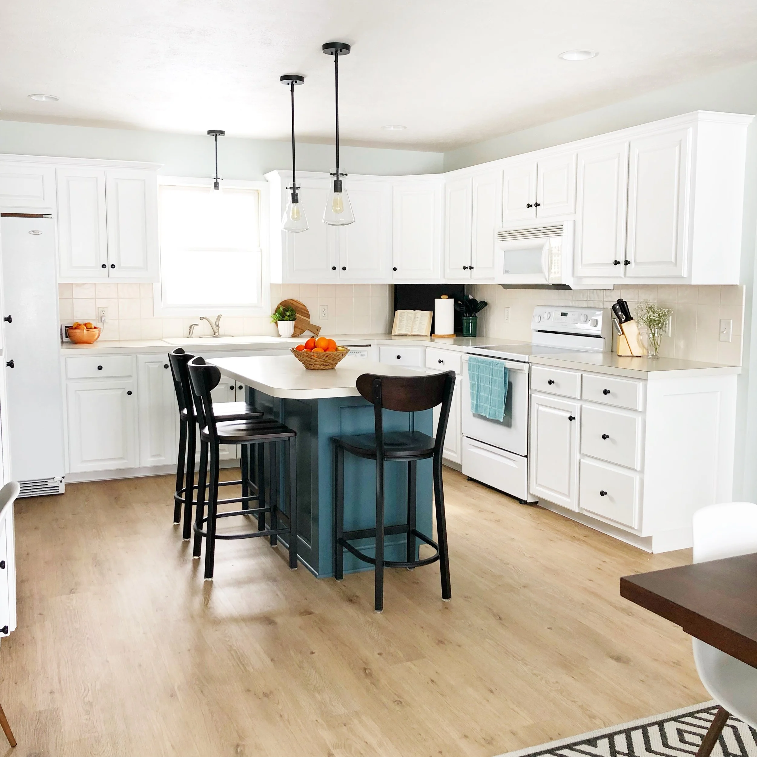
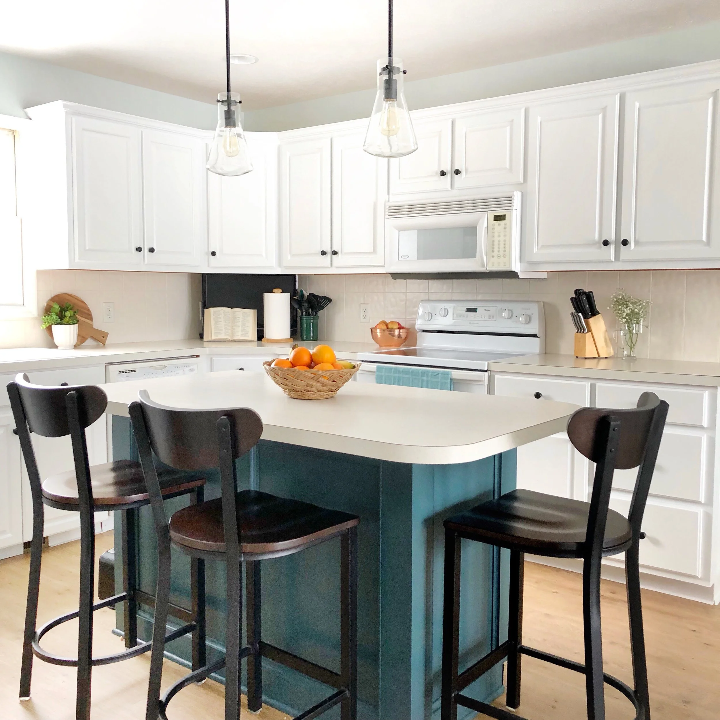
First to be tackled was a fresh coat of white paint on the perimeter cabinets and a deep, moody teal on the island which instantly brings the kitchen into the present and brightens the space! By sequencing the painting first, they didn’t need to worry about damage or drips on the floors, as flooring was next on the replacement list.
A luxury vinyl plank in a modern, refined oak was selected for the flooring. The quality, aesthetic, and durability of luxury vinyls continues to wow clients who are hesitant to go with a hardwood floor due to kids, pets, spills, upkeep or investment.
Lighting and accessories finish the space, with close attention paid to the shape and scale of the fixtures and their relationship to one another and the surrounding furnishings.
westside grand rapids #1: dining
A few suggestions for decor and accessories were all that was necessary for this Westside client. After a major kitchen renovation, including new flooring throughout the home, the dining room needed a bit of a refresh as well.
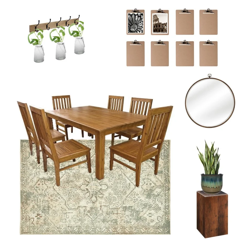
Keeping the beautiful wood dining set made sense, as it was a good fit for the space and a classic style. Replacing a large, rectangular mirror with coat hooks styled with jars of hanging greenery brought life to the space. A simple pedestal table elevates another plant in the corner of the room.
Knowing this is a family who enjoys travel and photography, developing an installation where photography could be easily swapped out in an unexpected way was a fun challenge. Several clipboards in a grid on the wall create an ever-changing gallery for the family’s most recent adventures. Black and white or sepia photos of architecture were recommended In order to create a cohesive grouping that reflected the sort of architectural feel inherent to dining spaces.
A touch of softness is added with an area rug, where subtle geometry echos the lines of the furnishings in the adjacent living area.

